Imagine a person signing up for a new SaaS tool. They expect a smooth start. Instead, they see a confusing dashboard with too many features to manage. Frustrating, right? And that is where visual onboarding shall shine. Raking in long walls of text or tedious tutorials can be tough. But it adds fun visuals, helpful guides, and easy step-by-step instructions.
The impact of visual onboarding is not just a more powerful first impression for SaaS businesses. So, customer retention, product adoption, and revenue growth are all directly affected.
Let’s look at a popular project management platform, for example. Before changing its onboarding process, new users had a hard time using the interface. This led to a 40% drop-off in the first week. The platform cut early churn by 50%. It replaced long tutorials with interactive checklists, animated tooltips, and contextual walkthroughs. This change also increased feature adoption rates.
What is Visual Onboarding?
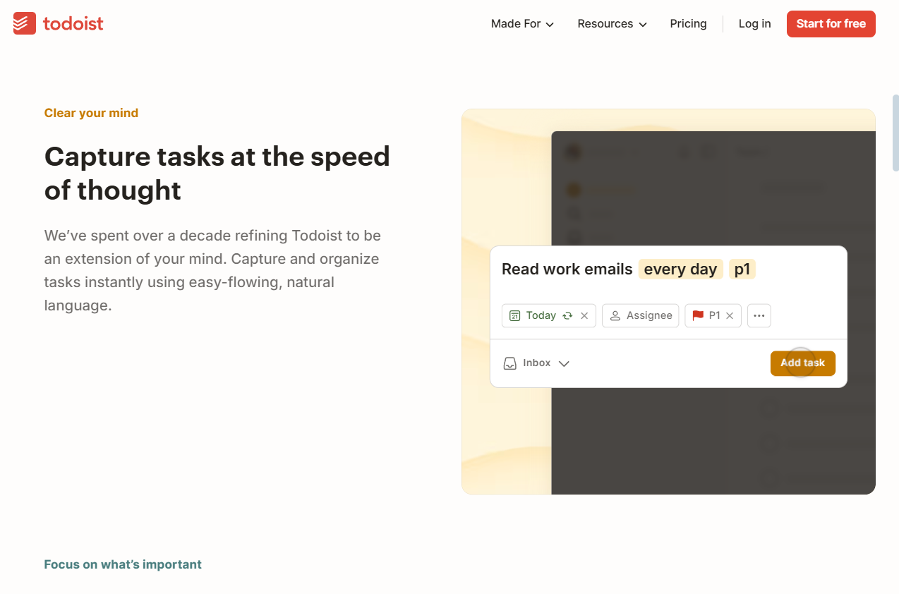
Visual onboarding uses videos, animations, tooltips, and more. It helps welcome users to a product quickly and easily. It removes friction, shortens the learning curve, and guides users to take key actions easily. This approach accelerates time-to-value, ensuring users see the benefits quickly and stick around longer.
An interactive tutorial helps users more than a confusing help center article does. It shows key tasks in real time, making it easier to understand. People engage with visual information 60,000 times faster than with text (Attending to Visual Stimuli versus Performing Visual Imagery as a … 5 Sept. 2018, https://pmc.ncbi.nlm.nih.gov/articles/PMC6125597/).
Many SaaS companies turn to explainer video production services. They create short, engaging videos that showcase key product features. Their product interfaces and email sequences often incorporate these videos to keep users engaged from the very first interaction.
How SaaS companies use visual onboarding at every stage
The end of onboarding for SaaS businesses is not the first login. There are several phases that make up the customer journey. Each phase has different visual guidance, and it is necessary to keep the users engaged. Let’s break it down.
First-Time User Experience (FTUX)
They are more likely to leave if they think they are lost or overwhelmed. The reduction of cognitive load is what SaaS companies focus on. Their goal is to simplify and reduce effort in onboarding.
- Interactive product tours – step-by-step guides that highlight key features.
- Progress indicators – visual checklists that show how much of the setup is complete.
- Micro-interactions – small animations that confirm actions and provide positive reinforcement.
A friendly guide sets up your workspace for you with Slack. It’s easy to follow along, beginning with features one by one—a method proven to reduce overwhelm. For example, Notion’s guided tours have gradually reduced new user confusion by 40% by introducing functionality. This approach ensures users aren’t bombarded with too much information at once, allowing them to learn at their own pace.
Activation Phase: Getting Users to Value Fast
Obviously, a user who signs up will not stay. The activation phase teaches them to see value in minutes, if not sooner. SaaS companies use:
- Contextual tooltips are small pop-ups. They show up when users hover over or click on specific elements.
- Personalized walkthroughs – Custom onboarding flows based on user roles or goals.
- Inline video tutorials – quick explainer clips embedded directly in the interface.

The onboarding process is designed for each user’s role: general manager, team member, or individual contributor. This guides each persona differently. Thus, it increases the chances of long-term adoption.
Note: Research shows that 65% of users expect to see the value of a product within the first 5 minutes of use. Quickly ensuring users see “time to value” (TTV) can cut churn and boost retention rates.
Adoption and Habit-Building
Long-term retention depends on getting the users to return regularly. Visual cues are used by SaaS companies to form habits such as:
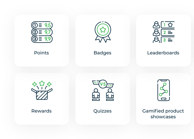
- Gamification: badges, progress bars, and rewards that encourage continued engagement.
- Success pop-ups: visuals that celebrate milestones, like completing the first project.
- Automated nudges – subtle reminders or notifications that keep users coming back.
Duolingo makes practice rewarding. Streak counters, fun animations, and small achievements motivate students. Such features earn motivation points as the learners are engaged.
Expansion and upselling
SaaS companies then gain premium features by using clever visual tricks once users find value.
- In-app upgrade prompts – highlighting advanced features with a locked icon or grayed-out options.
- Feature discovery tours – interactive demos showcasing premium functionalities.
- Personalized recommendations – suggesting upgrades based on user behavior.
There is a ‘Try Notion AI’ button on Notion—anyone can see the premium AI features on the free plan. Users can try AI-driven writing help. It offers suggestions, paraphrases, and summarizes text. This makes content creation more efficient. Notion’s AI analyzes what users input. It creates custom task lists and project timelines using its automated task management feature.
The platform’s premium features enhance the user experience. They show users all the platform’s capabilities. This encourages many to upgrade to the premium level. Notion shows the perks of its premium version right from the start. This helps boost user satisfaction and increases the chances of upgrading to premium plans.
Preventing Churn with Visual Cues
Often, users churn because they don’t perceive value in it. Visual strategies are used by SaaS companies to keep them engaged, such as:
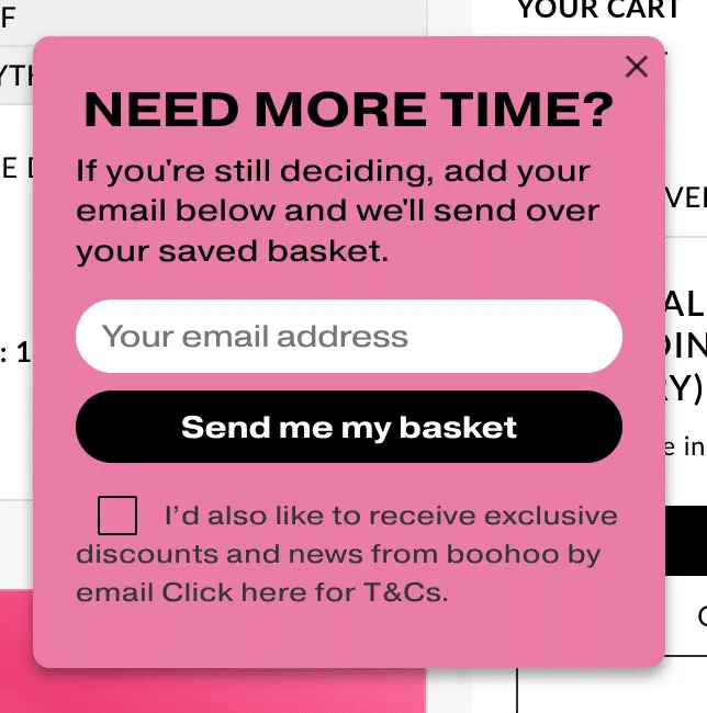
- Exit-intent pop-ups: offering discounts or guidance when users try to cancel.
- Re-engagement emails – featuring animated GIFs or videos to entice users back.
- Usage dashboards – Showing users their progress and achievements in a compelling manner.
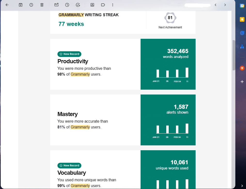
Grammarly sends users personalized reports. These are on how many words they have checked and how their writing has improved. It keeps users aware of the value of the resource that it is still providing.
The Role of AI and Personalization in Visual Onboarding
AI onboarding has changed how SaaS companies connect with users. Businesses now tailor onboarding flows based on user behavior, preferences, and past interactions. Better onboarding helps us personalize experiences. This makes things more intuitive and relevant. As a result, we reduce friction and boost retention.
AI can look at how a user interacts with a platform. Then, it can change the onboarding process. The steps can be detailed for the beginner and skipped for the advanced user. AI chatbots help users by providing quick answers to common questions. They also suggest the next steps.
The other important aspect is dynamic content delivery. AI can suggest onboarding content. It does this by looking at what users find hard. This is different from static tutorials. The system can show a short video or tooltip to explain a feature if a user hesitates. This timely help keeps users engaged. It prevents them from feeling stuck and encourages further exploration of the product. This boosts activation rates and engagement. It also raises the chances of upgrades or long-term commitments.
Our AI tools analyze user interactions in real time. They adjust the onboarding flow to fit each user’s needs. For beginners, the system offers clear guidance. This helps users understand the platform fully. Experienced users can bypass introductory steps, accessing advanced features directly.
AI chatbots improve this experience. They give quick answers to common questions and suggest next steps. This keeps users engaged during onboarding.
Another crucial aspect is dynamic content delivery. AI looks at how users behave. It finds areas where they might struggle. This is different from static tutorials, which provide general advice. If a user hesitates on a feature, the system can show a helpful video or tooltip. This helps prevent frustration and encourages them to keep exploring. This support keeps users engaged. It also boosts activation rates and encourages long-term commitment.
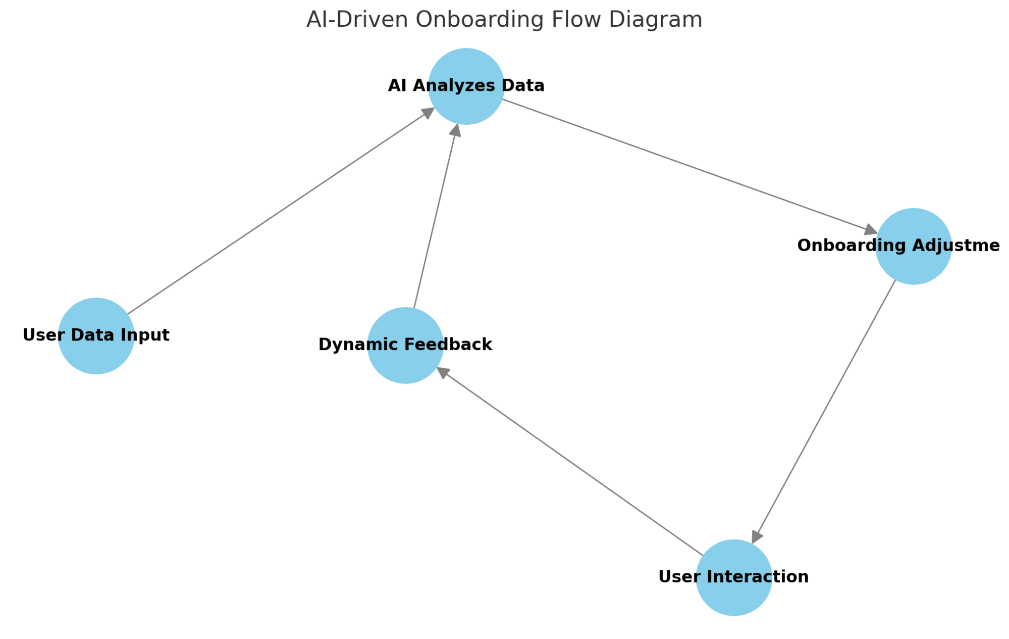
Visual Cue Suggestion: Use an animated graphic or flowchart. It can show how AI changes the onboarding process in real time based on user behavior. This will help users understand this dynamic system better.
Measuring the impact of visual onboarding on revenue
Visual onboarding isn’t just for user experience. It also impacts profits directly. The problem is, however, that it is difficult to measure success. KPIs help to understand the impact of an onboarding strategy on revenue expansion.
Time to value (TTV) is a key metric. It measures how fast users achieve their first success with the product. The longer the TTV, the higher the risk of loss and upselling. A strong visual onboarding process for TTV is essential. It helps users reach their important goals effectively.
Another key metric is the feature adoption rate. This shows how many users are using the important functionality. If users consistently ignore a set of features, it may mean that onboarding is not highlighting them well. Adding in-app guidance, product tours, and interactive elements helps users adopt features. This approach also boosts a product’s revenue potential.
Additionally, visual onboarding can be used for customer retention. Users who explore an easy onboarding experience are more likely to renew their subscription or upgrade to a higher plan. The churn rate is one of the KPIs that you want to monitor. The drop-off may require some adjustments. We might need to optimize the onboarding path by adding some blank space.
Expansion revenue (from upsells and cross-sells) is the final signal of how well onboarding helps to grow the business. Companies should change how they show premium features or higher-tier plans during onboarding if users don’t like them.
Common Pitfalls and How to Avoid Them
Visual onboarding can make the process engaging and user-friendly. But it can also fail badly if not done right.
1. Dumping too much information on users too quickly can be overwhelming. Delivering too many features too quickly can be overwhelming. This leads to cognitive load and disengagement. Introducing features progressively keeps users engaged and enjoying using them.
Overloaded dashboard
2. Not personalizing the experience. Just because there are different personas doesn’t mean that all users have the same needs. SaaS companies can target onboarding better by segmenting users.
3. Ignoring mobile optimization. Many SaaS products offer mobile versions despite the fact that they are often less clear and interactive than on the desktop. However, if onboarding flows work well on all devices, they keep users engaged.
4. Weak dynamic content delivery. AI looks at how users act to find where they might struggle. This is different from static tutorials, which give general advice. The system can show a helpful video or tooltip. This way, users avoid frustration and feel encouraged to keep exploring.
The one that gets missed is not tracking onboarding performance. Visual onboarding is crucial for many companies. However, most do not examine how users engage with it. You need real-time data feedback loops. Without them, you won’t know what’s working and what isn’t. Good testing methods, like where to place tooltips and using tutorial videos, boost the overall experience.
How to Iterate and Refine Onboarding Over Time
There is no such thing as “set it and forget it” onboarding. Top-performing SaaS companies often outsource their onboarding process. They rely on user data, feedback, and behavior patterns to improve it continuously. The trick is to onboard as a dynamic system that adapts to the product and customer needs.
A/B testing is one of the best ways to enhance onboarding. Companies can solve this issue by testing various product tours. They should also try tooltips and in-app messages. This way, they can see which options boost activation and engagement rates the most. If you see consistent user drop-off at a certain step, it is a clear sign that what is working is not working.
If users keep clicking but don’t progress, or if they hesitate during onboarding, it may mean there’s a clarity issue. This confusion can hinder their experience. You can fix these issues by changing visual cues, simplifying explanations, and moving key elements.
It is also equally important to collect direct user feedback from surveys and interviews. Some may want more guidance; others do not like too much guidance. You can improve the experience for different users by offering an optional onboarding path. This path can be tailored to their preferences.
Personalization at scale is also an important factor in refinement. SaaS companies can keep improving their onboarding experiences with AI and automation tools. These specialties are getting better all the time.
Why Visual Onboarding Is a Growth Engine for SaaS
SaaS companies can reach three key goals with visual onboarding.
- They boost revenue.
- They improve user retention.
- They build strong customer relationships.
A good onboarding method clears away barriers and speeds up value realization. It also creates many opportunities for users to achieve success.
Companies can improve their onboarding by focusing on three main elements:
- Automated personalization services
- Interactive tour paths
- Real-time performance data analysis
These tools help meet the evolving needs of customers.
Organizations that prioritize continuous improvement and optimization get better results. This leads to happier users, increased revenue growth, and reduced customer turnover.
Visual onboarding helps users explore product features. This process boosts their commitment to using the product. SaaS companies that reach this level of customer satisfaction turn their users into loyal advocates. These advocates help drive long-term business growth.